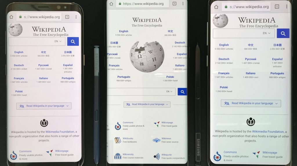
Smartphones these days often share a universal design. They are broad, rectangular, with a massive screen at the front, as well as an assortment of cameras at the back. Some companies try to change the pattern little by little; adding curves here, cutting out edges there. But for the most part, smartphones look pretty much the same. They also receive upgrades similar to their competition.
A GEM in the Rough
A new phone design revealed earlier this month may break the status quo. Here, the phone prototype had a very slim design – similar to a Wii remote, or a very tall iPod. The prototype’s name is GEM and may soon be in stores as early as next year.
Through a series of tweets, Essential Products CEO Andy Rubin revealed the concept. It is a very slim smartphone with a vertically long screen at the front. At the back, we have a singular camera and fingerprint scanner. Basically, it looks like a smartphone vertically sawn in half. Basing on this concept alone, the GEM phone has a few positives and negatives.
Pros of the Design:
- Slimmer figure makes it easier to hold, store, and use
- Extremely portable; perfect as a traveling phone
- Excellent purchase for those with smaller hands
- Slimmer design gives you a better grip when holding
- Minimalistic design
Cons of the Design:
- Half the width of an average smartphone means half the screen size
- A vertically long screen looks too narrow to actually do anything with it
- Reading would be a pain to do in this device
What do you think of this new smartphone design? Is it such a ridiculous change in design? Will it catch on, or will it be a bust? On the other hand, is it just a case of being ‘too ahead for its time’?
